ehrapy.plot.missing_values_heatmap#
- ehrapy.plot.missing_values_heatmap(edata, *, filter=None, max_cols=0, max_percentage=0, sort=None, figsize=(20, 12), fontsize=16, labels=True, label_rotation=45, cmap='RdBu', vmin=-1, vmax=1, cbar=True, categoricals=False, layer=None)[source]#
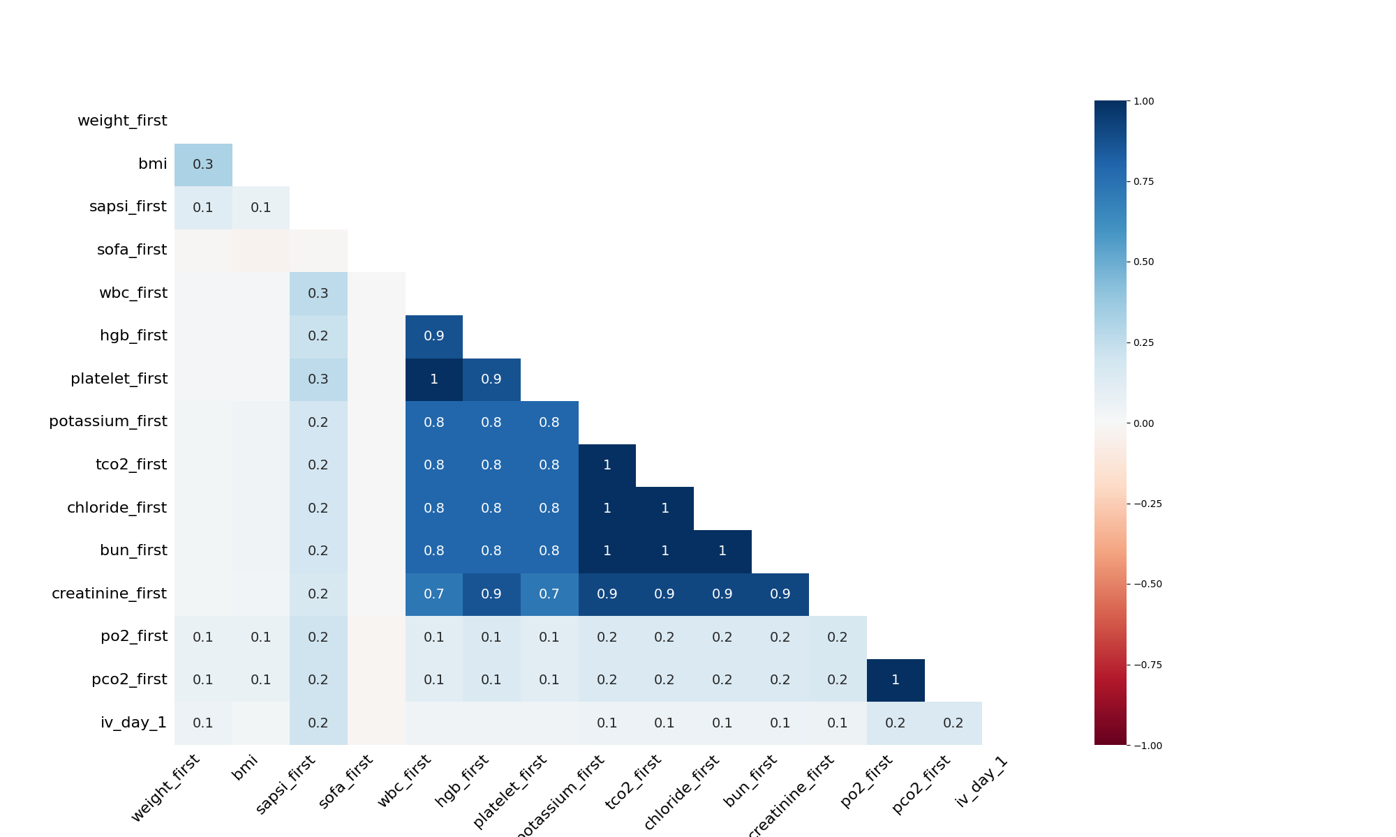
Presents a seaborn heatmap visualization of nullity correlation in the given data object.
Note that this visualization has no special support for large datasets. For those, try the dendrogram instead.
- Parameters:
edata (
EHRData) – Central data object.filter (
str|None, default:None) – The filter to apply to the heatmap. Should be one of “top”, “bottom”, or None.max_cols (
int, default:0) – The max number of columns from the data object to include.max_percentage (
float, default:0) – The max percentage fill of the columns from the data object.sort (
str|None, default:None) – The row sort order to apply. Can be “ascending”, “descending”, or None.figsize (
tuple, default:(20, 12)) – The size of the figure to display.fontsize (
float, default:16) – The figure’s font size.labels (
bool, default:True) – Whether or not to display the column names.label_rotation (
float, default:45) – What angle to rotate the text labels to.cmap (
str, default:'RdBu') – What matplotlib colormap to use.vmin (
int, default:-1) – The normalized colormap threshold.vmax (
int, default:1) – The normalized colormap threshold.cbar (
bool, default:True) – Whether to draw a colorbar.categoricals (
bool, default:False) – Whether to include “ehrapycat” columns to the plot.
- Returns:
The plot axis.
Examples
>>> import ehrdata as ed
>>> import ehrapy as ep
>>> edata = ed.dt.mimic_2()
>>> ep.pl.missing_values_heatmap(edata, filter="bottom", max_cols=15, max_percentage=0.999)
- Preview: