
Detection and mitigating bias in EHR data#
Biases in EHR data, originating from sources like selective documentation and demographic disparities, challenge healthcare analytics by skewing research outcomes and clinical decisions. These biases can lead to misrepresentation of patient groups and minorities. Exploratory data analysis (EDA), through data visualization, statistical summaries, and pattern identification, is a critical step in uncovering and mitigating biases.
In this tutorial, we outline the various sources of bias and show how they can be detected and potentially mitigated. Note that many biases are already inherent to the data collection process itself and can only be unveiled but not always dealt with. We make use of the Diabetes 130-US Hospitals for years 1999-2008 dataset (“Diabetes-130”) and synthetic datasets. (Strack et al. 2014)
Environment setup#
# !pip install fairlearn
import warnings

import ehrapy as ep
import ehrdata as ed
import matplotlib.pyplot as plt
import numpy as np
import pandas as pd
import seaborn as sns
from tableone import TableOne

warnings.filterwarnings("ignore")

# Custom plots: https://github.com/theislab/ehrapy-tutorials
from bias_utils import distributions_plot, grouped_barplot, plot_hist_normalization
plt.rcParams["figure.figsize"] = [10, 5]
The “Diabetes 130-US Hospitals for years 1998-2008” (“Diabetes-130”) dataset#
The dataset encompasses ten years of clinical data from 130 US hospitals, detailing hospital records for diabetic patients, including laboratory tests, medications, and up to 14-day stays. This dataset is per-patient-visit, not a per-patient basis. Beware that the same patient may be included multiple times.
Features#
features |
description |
|---|---|
race, gender, age |
demographic features |
medicare, medicaid |
insurance information |
admission_source_id |
emergency, referral, or other |
had_emergency, had_inpatient_days, |
hospital visits in prior year |
medical_specialty |
admitting physician’s specialty |
time_in_hospital, num_lab_procedures, |
description of the hospital visit |
discharge_disposition_id |
discharched to home or not |
readmitted, readmit_binary, |
readmission information |
Loading Diabetes-130#
We load a preprocessed version derived by the fairlearn team.
edata = ed.dt.diabetes_130_fairlearn()
ed.move_to_obs(edata, ["race", "gender", "age"], copy_columns=True)

# make prettier variable names
edata.obs.rename(columns={"race": "Race", "gender": "Gender", "age": "Age"}, inplace=True)
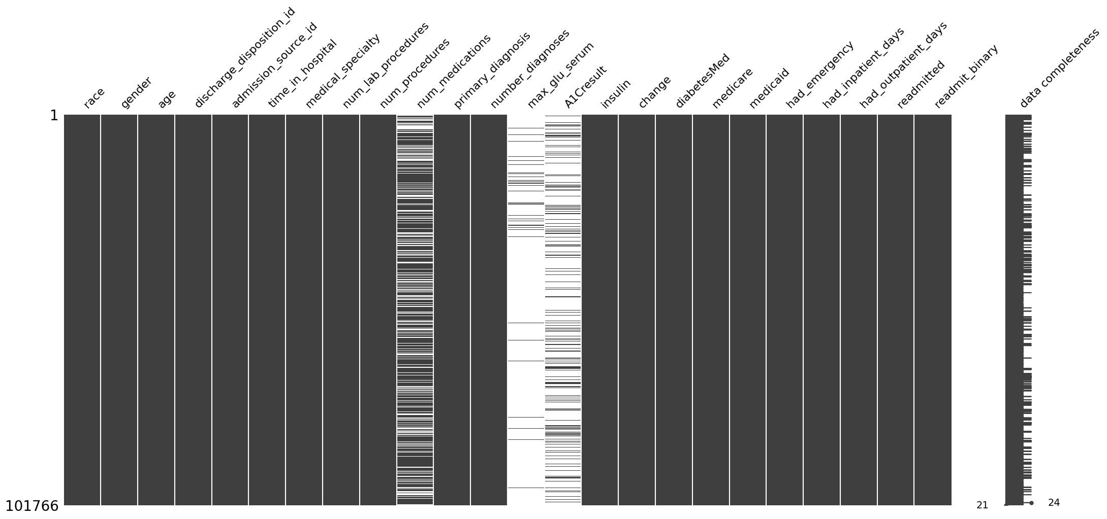
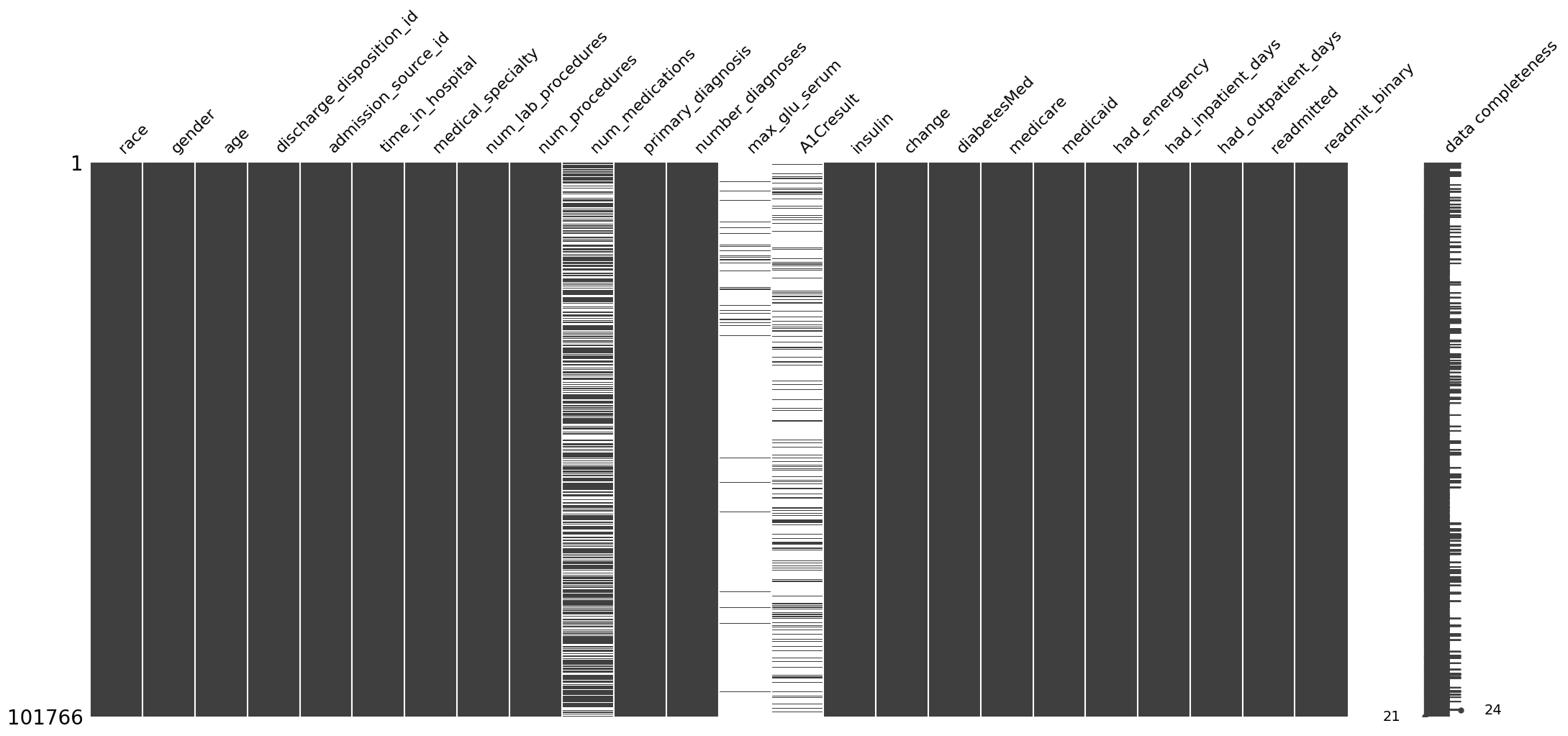
A quick check on the presence of missing data in the dataset can be obtained
ep.pl.missing_values_matrix(edata)
<Axes: >

We see that the dataset contains mostly completely recorded variables, except for max_glu_serum and A1Cresult variables, which are often missing.
Selection bias#
Selection bias occurs when the data are not representative of the general population, often because the individuals in the dataset are more likely to seek care or have certain conditions. This can lead to skewed results and incorrect inferences about disease prevalence, treatment effects, or health outcomes. For example, a study using EHR data from a specialized clinic may overestimate the prevalence of a specific condition because patients visiting the clinic are more likely to have that condition compared to the general population.
Scenario: Patient Demographics#
A popular option in clinical studies is by representing this information in a table:
TableOne(edata.obs)
| Missing | Overall | ||
|---|---|---|---|
| n | 101766 | ||
| Race, n (%) | AfricanAmerican | 19210 (18.9) | |
| Asian | 641 (0.6) | ||
| Caucasian | 76099 (74.8) | ||
| Hispanic | 2037 (2.0) | ||
| Other | 1506 (1.5) | ||
| Unknown | 2273 (2.2) | ||
| Gender, n (%) | Female | 54708 (53.8) | |
| Male | 47055 (46.2) | ||
| Unknown/Invalid | 3 (0.0) | ||
| Age, n (%) | '30 years or younger' | 2509 (2.5) | |
| '30-60 years' | 30716 (30.2) | ||
| 'Over 60 years' | 68541 (67.4) |
ehrapy allows to represent this information graphically as well:
ct = ep.tl.CohortTracker(edata)
ct(edata)
ct.plot_cohort_barplot()
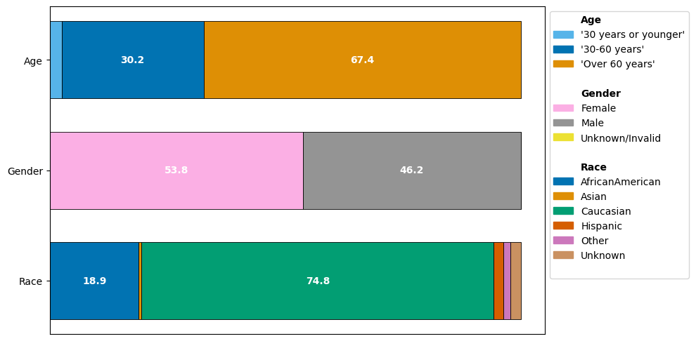
We can immediately observe how the different demographics are represented:
The age group “Over 60 years” is present more frequently than the other age groups “30 years or younger” and “30-60 years”.
The gender groups are balanced, with females forming a slight majority in the dataset. Only 3 visits have a label of “Unknown/Invalid”.
Caucasian are by far the most frequent group. While African American contributes a significant part of the dataset, Asian, Hispanic, Other and Unknown together form less than 7% of the data.
Any analysis take aways may be primarily bias towards characteristics of the Caucasian group if not controlled for. Notice that a perfect balance does not imply unbiasedness; if a disease is more prevalent among a subgroup, we would expect a non-uniform distribution from a representative dataset.
Mitigation strategies#
Discuss with data collectors early to ensure that the data collection and sampling process includes a wide range of patient demographics and health conditions.
Use stratified sampling techniques so that all relevant subgroups are represented according to their real-world or equal distribution.
Consider dropping groups that can lead to too small sample sizes when stratified sampling is used. See section “Decision point: How do we address smaller group sizes?” here.
Employ propensity score matching to adjust for variables that predict receiving the treatment, thus balancing the data.
Apply inverse probability weighting (that is, assign more weight to groups infrequently observed) to adjust the influence of observed variables that could lead to selection bias.
Here, in the later discussed algorithmic bias example we will:
merge the three smallest race groups Asian, Hispanic, Other (similar to Strack et al., 2014)
drop the gender group Unknown/Invalid, because the sample size is so small that no meaningful assessment is possible
Filtering bias#
Filtering bias emerges when the criteria used to include or exclude records in the analysis are unintendedly or unexpectedly filtering for other variables as well, potentially leading to a non-representative sample of the original population. This bias can obscure the true relationships between variables by systematically removing certain patient groups based on arbitrary or non-transparent criteria.
Scenario: Medicare#
Consider below an example where one filters to the subgroup of Medicare recipients. Medicare is only available to people over the age of 65 and younger individuals with severe illnesses.
edata_filtered = edata.copy()

ct = ep.tl.CohortTracker(edata_filtered, columns=["Age", "Gender", "Race"])
ct(edata_filtered, label="Initial Cohort")

edata_filtered = edata_filtered[np.where(edata_filtered.X[:, np.where(edata_filtered.var_names == "medicare")[0]])[0]]
ct(edata_filtered, label="Filtered to medicare recipients")
fig, _ = ct.plot_cohort_barplot(
    subfigure_title=True,
    show=False,
)
fig.subplots_adjust(hspace=0.4)
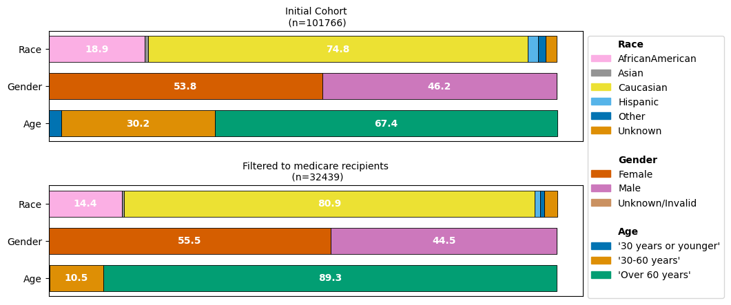
While we would expect that our medicare-recipients filtered dataset will consist predominantly of patients over 60 years, we might not have expected that the imbalance of the different reported race groups is aggraveted.
Mitigation strategies#
Explicitly define and consistently apply inclusion and exclusion criteria for the dataset.
Document the rationale for all inclusion and exclusion decisions by tracking the cohort.
Track and report key variables of the patient population representation in the dataset.
Perform sensitivity analysis for any potentially confounding variables.
Surveillance bias#
Surveillance bias occurs when the likelihood of detecting a condition or outcome is influenced by the intensity or frequency of monitoring, leading to an overestimation of the association between exposure and outcome. For instance, individuals in a clinical trial may receive more rigorous testing and follow-up compared to the general population, thus appearing to have higher rates of certain conditions or side effects.
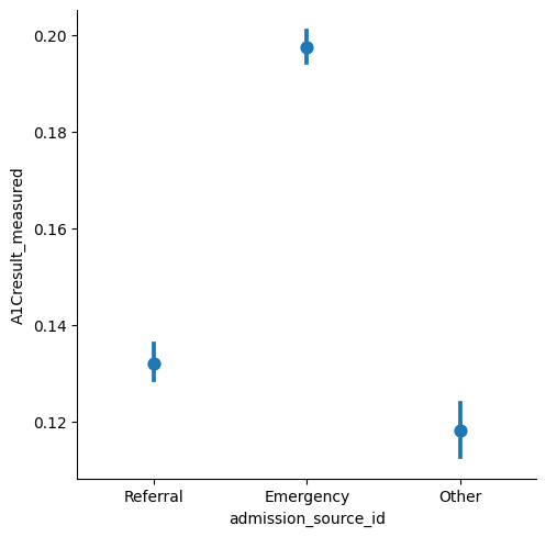
Scenario: Hemoglobin A1c measurement frequency#
Hemoglobin A1c (HbA1c) is an important measure of glucose control, which is widely applied to measure performance of diabetes care (Strack et al., 2014).
Strack et al. highlight that the measurement of HbA1c at the time of hospital admission offers an opportunity to assess the current diabetes therapy efficacy, but is only done in 18.4% of patients in the inpatient setting. Here, we can observe that differences between the patient admission type seem to exist: Namely, it appears to be measured more frequently for emergency admissions than for referrals.
ed.move_to_obs(edata, ["A1Cresult", "admission_source_id"], copy_columns=True)
edata.obs["A1Cresult_measured"] = ~edata.obs["A1Cresult"].isna()
ep.pl.catplot(
    edata=edata,
    y="A1Cresult_measured",
    x="admission_source_id",
    kind="point",
    join=False,
)
<seaborn.axisgrid.FacetGrid at 0x17f6c9550>
Mitigation strategies#
When recording the data (talk to data collectors):
Ensure that all groups within the study are monitored with the same frequency and thoroughness, based on standardized clinical protocols.
Design prospective studies to specify and control the monitoring frequency and methods for all patient cohorts from the outset.
Apply universal screening or monitoring guidelines across all patient groups to minimize variability in data arising from differential surveillance.
When evaluating the data:
Use statistical methods to adjust analyses for different levels of surveillance among patient groups, such as stratification or multivariable models that include surveillance intensity as a covariate.
Take particular care when drawing collective conclusions on patients experiencing different degrees of surveillance.
Consult the data collectors to learn when and why they record specific values.
Missing data bias#
Missing data bias refers to the distortion in analysis results caused by systematic absence of data points. Rubin (1976) classified missing data into three categories:
Missing Completely at Random (MCAR) where the probability of a value being missing is the same for all cases
Missing at Random (MAR) where the probability of a value being missing is depends on other observed variables
Missing Not at Random (MNAR) where the probability of a value being missing depends on variables that are not observed
Each type affects the data and subsequent analyses differently, with MCAR having the least impact since the missingness is unrelated to the study variables or outcomes, whereas MAR and NMAR can introduce significant bias in an analysis. For instance, if patients with more mild symptoms are less likely to have complete records (NMAR), analyses may overestimate the severity and impact of certain conditions.
Scenario: MCAR and MAR of number of medications#
We showcase this bias on the Diabetes-130 dataset, where we introduce missing data in the num_medications variable
According to an MCAR mechanism
According to an MAR mechanism
# reload dataset
edata = ed.dt.diabetes_130_fairlearn()
ed.move_to_obs(edata, ["time_in_hospital"], copy_columns=True)
The original dataset does not contain missing values in this variable.
ep.pl.missing_values_matrix(edata)
<Axes: >
MCAR#
We now introduce random missingness in the num_medications variable, causing 30% of the data to be missing
# create reproductible MCAR missing values
rng = np.random.default_rng(2)
mcar_mask = rng.choice([True, False], size=len(edata), p=[0.3, 0.7])
# create a new EHRData with these missing values
edata_mcar = edata.copy()
edata_mcar.X[mcar_mask, edata_mcar.var_names == "num_medications"] = np.nan
We can visualize the degree of missingness:
ep.pl.missing_values_matrix(edata_mcar)
<Axes: >
We can see that under the MCAR mechanism, the shape of the distribution, its mean and its variance here do not systematically deviate:
distributions_plot(
    ["Complete", "MCAR"],
    [edata, edata_mcar],
    "num_medications",
)
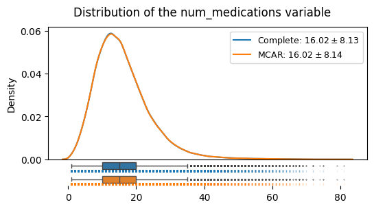
Little’s MCAR test is a statistical test, with the null hypothesis being that the data is MCAR. Care is to be taken when interpreting such results, as the practical value of such statistical tests is still under discussion van Buuren (2018). We consider the relationship of two variables of interest in this example:
pvalue = ep.pp.mcar_test(edata_mcar[:, edata_mcar.var_names.isin(["num_medications", "time_in_hospital"])])
print(f"pvalue of Little's MCAR test: {pvalue:.2f}")
pvalue of Little's MCAR test: 0.71
With a p-value of 0.71, we obtain no indication of the missingness in Num. Medication per stay with the observed data about the time_in_hospital being not MCAR: its important to note that this is not a prove of the data being MCAR. Rather, low p-values should spark attention in particular. See Schouten 2021 for more details.
MAR#
We now introduce MNAR in the num_medications variable.
We use time_in_hospital to have an impact on the probability of the num_medications variable by generating a synthetic example where the probability of the num_medications variable being missing is larger, the longer the time_in_hospital is.
This simulates a situation where the medication sheet would get lost at one point during the patients stay, with longer stays making it more probable to have the sheet lost somewhen along the way.
edata.obs
| time_in_hospital | |
|---|---|
| 0 | 1 |
| 1 | 3 |
| 2 | 2 |
| 3 | 2 |
| 4 | 1 |
| ... | ... |
| 101761 | 3 |
| 101762 | 5 |
| 101763 | 1 |
| 101764 | 10 |
| 101765 | 6 |
101766 rows × 1 columns
# Scale the time_in_hospital variable
time_in_hospital = edata.obs["time_in_hospital"].astype(float)
continuous_values = np.array(time_in_hospital - np.mean(time_in_hospital)) / np.std(time_in_hospital)
# small offset to steer the degree of missingness
continuous_values *= 1.2
continuous_values -= 0.6

# Convert continuous values to probabilities using the logistic function
probabilities = 1 / (1 + np.exp(-continuous_values))
probabilities

# Generate MAR mask based on probabilities
rng = np.random.default_rng(2)
mar_mask = rng.binomial(1, probabilities).astype(bool)

edata_mar = edata.copy()
edata_mar.X[mar_mask, edata_mar.var_names == "num_medications"] = np.nan
We can visualize the degree of introduce missingness:
ep.pl.missing_values_matrix(edata_mar)
<Axes: >
distributions_plot(
    ["Complete", "MAR"],
    [edata, edata_mar],
    "num_medications",
)
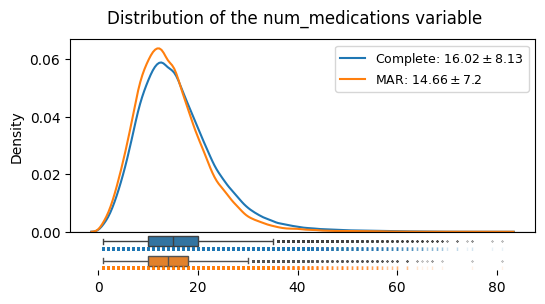
We can see that under the MAR mechanism, the shape of the distribution, its mean and its variance do systematically deviate from the complete case. This is different from the MCAR case. The mean droppped from 16.02 to 14.66. Also, the standard deviation changed form 8.13 to 7.14.
Such a scenario illustrates that we do have interest in imputing missing data, in a meaningful way.
We can again use Little’s Test to evaluate the missing data behaviour between our two variables of interest, on our synthetic MAR data:
pvalue = ep.pp.mcar_test(edata_mar[:, edata_mar.var_names.isin(["num_medications", "time_in_hospital"])])
print(f"pvalue of Little's MCAR test: {pvalue:.3f}")
pvalue of Little's MCAR test: 0.000
Here, the pvalue of (rounded) < 0.001 according to Little’s Test should make us reject our Null Hypothesis being the data is MCAR with respect to these two variables: Indeed, we know by our constructed example that the data is missing according to an MAR mechanism between these two variables.
Mitigation strategies#
There is a lot of literature on missing data for a first dive into more details such as van Buuren (2018), Schouten 2021.
Improve data collection processes to reduce the occurrence of missing data, including training for healthcare providers on the importance of complete data entry.
Preventing missing data is the most direct handle on problems caused by the missing data.
Determine the type of missing data (MCAR, MNAR, MAR) if possible.
Consider data augmentation strategies, such as linking EHR data with other databases (e.g., insurance claims, registries) to fill gaps.
Visualize missing data patterns to get an intuition of potential confounders and dependencies.
Many algorithms require dense matrices without missing data. Therefore, a common task is imputing the missing data which can lead to further biases that are discussed next.
Imputation bias#
Imputation bias, a specific form of algorithmic bias, occurs when the process used to estimate and fill in (impute) missing values introduces systematic differences between the imputed values and the true values.
When the data is MCAR, mean, median, or mode imputation for continuous variables does not introduce systematic bias to these statistics of the overall distribution of this continuous variable. However, it commonly introduces an underestimation of the variance of the data. In the MAR case, mean imputation of continuous variables introduces bias into the overall distribution of the variable: both its location and variance can be significantly biased.
See van Buuren (2018) for a detailed discussion.
We showcase this bias on the Diabetes-130 dataset, where we introduced missing data in the num_medications variable in the section before:
According to an MCAR mechanism
According to an MAR mechanism
Scenario: Mean Imputation in the MCAR case#
We start off by showcasing mean imputation’s behaviour in the MCAR setting. We first perform a simple mean imputation on our num_medications variable, and consider the new distribution with a histogram:
edata_mcar_mean_imputed = ep.pp.simple_impute(edata_mcar, var_names=["num_medications"], strategy="mean", copy=True)
distributions_plot(
    ["Complete", "MCAR", "MCAR (mean imputed)"],
    [edata, edata_mcar, edata_mcar_mean_imputed],
    "num_medications",
)
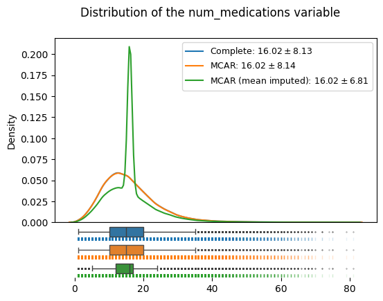
We can see immediately how the overall location of the distribution is not affected by mean imputation in the MCAR case (even though the median might have tipped): however, we can see that the variance now gets severly underestimated: the standard deviation dropped from to 8.1 in the original data to 6.8 in the imputed data.
The reason for this can be observed in the density plot, namely that the mean imputation leads to all formerly missing instances being assigned a single value.
Scenario: Mean Imputation in the MAR case#
We now consider the MAR case from the previous section on missing data. We first perform a simple mean imputation on our num_medications variable:
edata_mar_mean_imputed = ep.pp.simple_impute(edata_mar, var_names=["num_medications"], strategy="mean", copy=True)
We now also perform a more sophisticated approach: e.g. Multiple imputation has been shown to perform well for MAR data. Here, we apply one such strategy, the MissForest imputation, as implemented in ehrapy:
# consider for imputation only the two variables of our focus
edata_mar_medication_hospital_time = ed.EHRData(
    edata_mar[:, edata_mar.var_names.isin(["time_in_hospital", "num_medications"])].X.copy().astype(np.float64),
)
edata_mar_medication_hospital_time.var_names = ["time_in_hospital", "num_medications"]
ed.infer_feature_types(edata_mar_medication_hospital_time)

edata_mar_medication_hospital_time_imputed = ep.pp.miss_forest_impute(edata_mar_medication_hospital_time, copy=True)
! Feature was detected as categorical features stored numerically. Adjust using `ed.replace_feature_types` if needed.
 Detected feature types for EHRData object with 101766 obs and 2 vars
╠══ 📅 Date features
╠══ 📐 Numerical features
║   ╠══ num_medications
║   ╚══ time_in_hospital
╚══ 🗂️ Categorical features
distributions_plot(
    ["Complete", "MAR", "MAR Mean Imputed", "MAR MissForest Imputed"],
    [
        edata,
        edata_mcar,
        edata_mar_mean_imputed,
        edata_mar_medication_hospital_time_imputed,
    ],
    "num_medications",
)
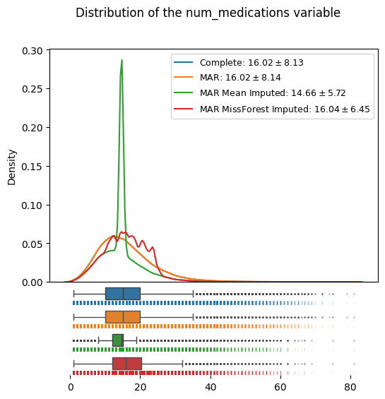
We can see how the MAR missing data (orange) contains a systematic distortion towards smaller values compared to the complete, known data (blue) by our construction.
The mean imputation (green), which yielded a valid estimate of the mean in the MCAR case, now is not a valid imputation anymore; both the location and the variance of the mean imputed dataset with MAR missing data are skewed compared to the (known) complete data.
MissForest imputation (red) shows superior results in both location and scale of the data distribution: The imputed datasets has a mean of 16.04, close to the true, known mean of 16.02. Its flexible imputation also generates a more realistic distribution of the data, as opposed to the variance shrinking mean imputation.
Importantly, imputation is not about “recreating the lost data”, but about being able to make valid inference from the incomplete data van Buuren (2018). The behaviour of skewed location and variance in the data distribution here demonstrates how imputation methods under different missing data models can manifest biases in our analyses.
Mitigation Strategies#
As mentioned in the missing data section, extensive literature on missing data and imputation is available. For a first dive into more details e.g. van Buuren (2018), Schouten 2021 can be considered.
Conduct thorough exploratory analysis to understand the patterns and mechanisms of missing data to guide the choice of the most appropriate imputation method.
Select imputation methods that best fit the data distribution and the mechanism of missingness. Multiple imputation methods have been shown to perform well under many circumstances.
Validate the imputation by comparing the characteristics of the imputed data with the observed data.
Avoid imputation in cases of high proportions of missing data where the imputation might dominate the analytical results.
Use robustness checks, such as repeating the analysis with different imputation methods or omitting imputation altogether (using sparse matrices), to assess the impact of the imputation on the study conclusions.
Be wary of clusters in the data that have high percentage of missing data.
Algorithmic bias#
Algorithmic bias occurs when algorithms systematically perform better for certain groups than for others, often due to biases inherent in the data used to train these algorithms. This can result in unequal treatment recommendations, risk predictions, or health outcomes assessments across different demographics, such as race, gender, or socioeconomic status. For instance, an algorithm trained predominantly on data from one ethnic group may perform poorly or inaccurately predict outcomes for individuals from underrepresented groups, exacerbating disparities in healthcare access and outcomes.
Scenario: Recommending patients for high-risk care management programs#
Here, we adapt an example from the Fairlearn SciPy 2021 Tutorial: Fairness in AI Systems.
We predict hospital readmission within 30 days from the earlier introduced dataset of hospital data of diabetic patients. Such a quick readmission is viewed as proxy that the patient needed more assistance at release time and is therefore our target variable.
We follow the decision in the earlier work to measure the:
balanced accuracy to investigate the performance of the algorithm
selection rate to investigate how many patients are recommended for care
false negative rate to investigate how many patients would have missed the needed assistance
An investigation is needed to determine whether any patient subgroups within the demographic variable race are negatively affected by a model.
from fairlearn.metrics import MetricFrame, false_negative_rate, selection_rate
from fairlearn.postprocessing import ThresholdOptimizer
from sklearn.linear_model import LogisticRegression
from sklearn.metrics import RocCurveDisplay, balanced_accuracy_score
from sklearn.model_selection import train_test_split
from sklearn.pipeline import Pipeline
from sklearn.preprocessing import StandardScaler
Data Preparation#
We load the dataset, and put variables we don’t want to pass to our model into the .obs field.
We build a binary label readmit_30_days indicating whether a patient has been readmitted in <30 days.
edata_algo = ed.dt.diabetes_130_fairlearn(
    columns_obs_only=[
        "race",
        "gender",
        "age",
        "readmitted",
        "readmit_binary",
        "discharge_disposition_id",
    ]
)
edata_algo.obs["readmit_30_days"] = edata_algo.obs["readmitted"] == "<30"
In our dataset, our patients are predominantly Caucasian (75%). The next largest racial group is AfricanAmerican, making up 19% of the patients. The remaining race categories (including Unknown) compose only 6% of the data. In this dataset, gender is primarily reported binary, with 54% Female and 46% Male, and 3 samples annotated as Unknown/Invalid
TableOne(edata_algo.obs, columns=["race", "gender", "age"])
| Missing | Overall | ||
|---|---|---|---|
| n | 101766 | ||
| race, n (%) | AfricanAmerican | 19210 (18.9) | |
| Asian | 641 (0.6) | ||
| Caucasian | 76099 (74.8) | ||
| Hispanic | 2037 (2.0) | ||
| Other | 1506 (1.5) | ||
| Unknown | 2273 (2.2) | ||
| gender, n (%) | Female | 54708 (53.8) | |
| Male | 47055 (46.2) | ||
| Unknown/Invalid | 3 (0.0) | ||
| age, n (%) | '30 years or younger' | 2509 (2.5) | |
| '30-60 years' | 30716 (30.2) | ||
| 'Over 60 years' | 68541 (67.4) |
Decision: How to address smaller group sizes?#
We have seen different strategies to address smaller group sizes in the selection bias part.
For the
racevariable, we will follow the strategy of using buckets to merge small groups Other, Spanish, Asian.For the
gendervariable, we will remove the Unknown/Invalid annotated samples, as no meaningful assessment is possible with this sample size
# aggregate small groups
edata_algo.obs["race_all"] = edata_algo.obs["race"]
edata_algo.obs["race"] = edata_algo.obs["race"].replace({"Asian": "Other", "Hispanic": "Other"})

# drop gender group Unknown/Invalid
edata_algo = edata_algo[edata_algo.obs["gender"] != "Unknown/Invalid", :].copy()
edata_algo = ed.move_to_x(edata_algo, "gender")
We now prepare our variables required for model training, and encode categorical variables in the data.
edata_algo = ep.pp.encode(
    edata_algo,
    autodetect=True,
)
We split our data into train and test groups.
train_idxs, test_idxs = train_test_split(
    np.arange(edata_algo.n_obs),
    stratify=edata_algo.obs["race"],
    test_size=0.5,
    random_state=0,
)
edata_algo_train = edata_algo[train_idxs, :]
edata_algo_test = edata_algo[test_idxs, :]
edata_algo_train.obs["readmit_30_days"].value_counts()
readmit_30_days
False    45214
True      5667
Name: count, dtype: int64
To account for label imbalance of our target variable readmit_30_days with more False than True cases, we do balanced subsampling by performing Random Undersampling:
edata_algo_train_balanced = ep.pp.sample(
    edata_algo_train,
    balanced=True,
    balanced_key="readmit_30_days",
    copy=True,
)
edata_algo_train_balanced.obs["readmit_30_days"].value_counts()
readmit_30_days
False    5667
True     5667
Name: count, dtype: int64
Model Training#
unmitigated_pipeline = Pipeline(
    steps=[
        ("preprocessing", StandardScaler()),
        ("logistic_regression", LogisticRegression(max_iter=1000)),
    ]
)
unmitigated_pipeline.fit(
    edata_algo_train_balanced.X,
    edata_algo_train_balanced.obs["readmit_30_days"].astype(bool),
)
Pipeline(steps=[('preprocessing', StandardScaler()),
                ('logistic_regression', LogisticRegression(max_iter=1000))])
In a Jupyter environment, please rerun this cell to show the HTML representation or trust the notebook. On GitHub, the HTML representation is unable to render, please try loading this page with nbviewer.org.
Pipeline(steps=[('preprocessing', StandardScaler()),
('logistic_regression', LogisticRegression(max_iter=1000))])StandardScaler()
LogisticRegression(max_iter=1000)
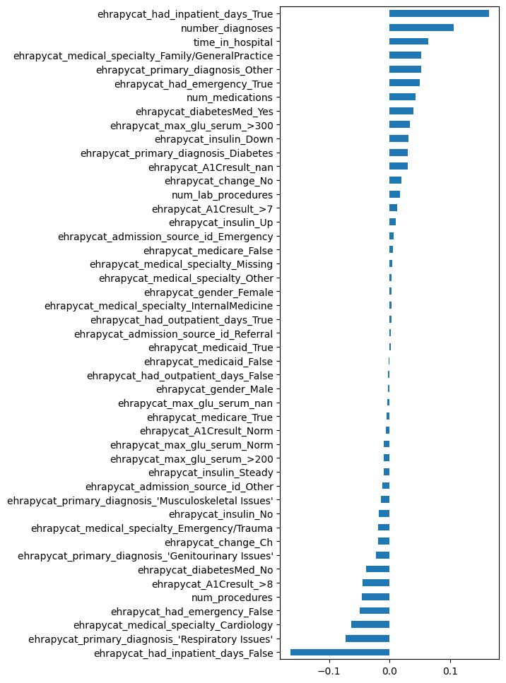
We can inspect our model’s coefficients:
coef_series = pd.Series(
    data=unmitigated_pipeline.named_steps["logistic_regression"].coef_[0],
    index=edata_algo_train_balanced.var_names,
)
coef_series.sort_values().plot.barh(figsize=(4, 12), legend=False);
To check our model performance on the test data, we first look at the ROC curve of this binary classifier:
Y_pred_proba = unmitigated_pipeline.predict_proba(edata_algo_test.X)[:, 1]
Y_pred = unmitigated_pipeline.predict(edata_algo_test.X)

RocCurveDisplay.from_estimator(
    unmitigated_pipeline,
    edata_algo_test.X,
    edata_algo_test.obs["readmit_30_days"].astype(bool),
);
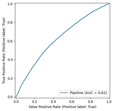
We observe an overall balanced accuracy of 0.59, well about random chance, albeit showing that the simplified model and assumptions are far from a reliable prediction.
balanced_accuracy_score(edata_algo_test.obs["readmit_30_days"].astype(bool), Y_pred.astype(bool))
np.float64(0.594101838016029)
Using fairlearn’s MetricFrame utility, we can conveniently inspect our target model performance measurements:
metrics_dict = {
    "selection_rate": selection_rate,
    "false_negative_rate": false_negative_rate,
    "balanced_accuracy": balanced_accuracy_score,
}

mf1 = MetricFrame(
    metrics=metrics_dict,
    y_true=edata_algo_test.obs["readmit_30_days"],
    y_pred=Y_pred,
    sensitive_features=edata_algo_test.obs["race"],
)

mf1.by_group
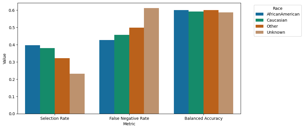
| selection_rate | false_negative_rate | balanced_accuracy | |
|---|---|---|---|
| race | |||
| AfricanAmerican | 0.396668 | 0.426841 | 0.599343 |
| Caucasian | 0.380289 | 0.456405 | 0.592059 |
| Other | 0.322180 | 0.497653 | 0.600296 |
| Unknown | 0.230837 | 0.611650 | 0.586617 |
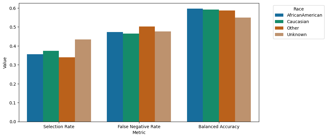
A barplot represents this information graphically:
grouped_barplot(mf1.by_group)
Certainly, here’s a refined version:
“We observe comparable performance in terms of balanced accuracy across demographic groups. However, there is notable variation in selection rates, with African American, Caucasian, Other, and Unknown subgroups exhibiting higher rates in descending order. This discrepancy becomes particularly relevant in the context of fairness, as per fairlearn’s framework, where the low selection rates and poorer False Negative rates could potentially harm these smaller subgroups. A False Negative prediction entails erroneously predicting ‘no early readmission’ following a visit where early readmission did occur. The model’s performance disparities, especially concerning the Unknown racial group, highlight bias towards this demographic in this specific aspect.”
Mitigation: fairlearn’s ThresholdOptimizer#
Towards a mitigation, we instantiate ThresholdOptimizer with the logistic regression estimator:
postprocess_est = ThresholdOptimizer(
    estimator=unmitigated_pipeline,
    constraints="false_negative_rate_parity",
    objective="balanced_accuracy_score",
    prefit=True,
    predict_method="predict_proba",
)
postprocess_est.fit(
    edata_algo_train_balanced.X,
    edata_algo_train_balanced.obs["readmit_30_days"],
    sensitive_features=edata_algo_train_balanced.obs["race"],
)
Y_pred_postprocess = postprocess_est.predict(edata_algo_test.X, sensitive_features=edata_algo_test.obs["race"])
metricframe_postprocess = MetricFrame(
    metrics=metrics_dict,
    y_true=edata_algo_test.obs["readmit_30_days"],
    y_pred=Y_pred_postprocess,
    sensitive_features=edata_algo_test.obs["race"],
)
pd.concat(
    [mf1.by_group, metricframe_postprocess.by_group],
    keys=["Unmitigated", "ThresholdOptimizer"],
    axis=1,
)
| Unmitigated | ThresholdOptimizer | |||||
|---|---|---|---|---|---|---|
| selection_rate | false_negative_rate | balanced_accuracy | selection_rate | false_negative_rate | balanced_accuracy | |
| race | ||||||
| AfricanAmerican | 0.396668 | 0.426841 | 0.599343 | 0.355128 | 0.473439 | 0.596497 |
| Caucasian | 0.380289 | 0.456405 | 0.592059 | 0.373798 | 0.464543 | 0.591131 |
| Other | 0.322180 | 0.497653 | 0.600296 | 0.340344 | 0.502347 | 0.587570 |
| Unknown | 0.230837 | 0.611650 | 0.586617 | 0.434361 | 0.475728 | 0.549442 |
Y_pred_mitig = postprocess_est.predict(edata_algo_test.X, sensitive_features=edata_algo_test.obs["race"])
balanced_accuracy_score(edata_algo_test.obs["readmit_30_days"].astype(bool), Y_pred_mitig.astype(bool))
np.float64(0.5912464638281469)
grouped_barplot(metricframe_postprocess.by_group)
We can observe that the performance especially across the subgroups under-represented in the dataset could be enhanced. In particular, the false negative rate, predicting patients of particular need to not belong to this class, could be increased for the underrepresented groups.
Mitigation Strategies#
Engage diverse stakeholders, including ethicists and representatives from impacted groups, during the algorithm development and review process to provide perspectives on potential bias.
Ensure that the training data includes a diverse and representative sample of the population, covering various demographics to prevent skewed model outcomes.
Validate model outcomes across different demographic groups to ensure that the algorithm performs equitably before it is used widely in clinical settings.
Maintain transparency in algorithm development with clear documentation of decision criteria, data sources, and modeling techniques.
Conduct regular audits of algorithm performance to check for biases, involving external audits if possible to ensure impartiality.
Consider using toolboxes such as fairlearn to enhance model fairness.
Normalization bias#
Normalization biases arise when the methods used to standardize or normalize data across different scales or distributions inadvertently distort the underlying relationships or magnitudes in the data. This can occur if the normalization technique does not account for intrinsic variability within subgroups or assumes a uniform distribution where it does not exist, leading to misleading interpretations of the data’s true structure. For example, applying the same normalization method to clinical measurements that vary widely between demographic groups (e.g., pediatric vs. adult populations) can mask important physiological differences and affect the accuracy of subsequent analyses.
Scenario: Normalizing separately and jointly#
We consider for a visualization how the Number of Medications within one stay are distributed between stays of patients of two age groups (“Younger than 30”, and “Older than 30”)
edata = ed.dt.diabetes_130_fairlearn()
ed.move_to_obs(edata, var_names=["age", "num_medications"], copy_columns=True)

edata.obs["Age Group"] = np.where(edata.obs["age"] == "'30 years or younger'", "Younger than 30", "Older than 30")
ed.infer_feature_types(edata)
edata = ep.pp.encode(edata, autodetect=True)
! Feature 'readmit_binary' was detected as categorical features stored numerically. Adjust using `ed.replace_feature_types` if needed.
 Detected feature types for EHRData object with 101766 obs and 24 vars
╠══ 📅 Date features
╠══ 📐 Numerical features
║   ╠══ num_lab_procedures
║   ╠══ num_medications
║   ╠══ num_procedures
║   ╠══ number_diagnoses
║   ╚══ time_in_hospital
╚══ 🗂️ Categorical features
    ╠══ A1Cresult (3 categories)
    ╠══ admission_source_id (3 categories)
    ╠══ age (3 categories)
    ╠══ change (2 categories)
    ╠══ diabetesMed (2 categories)
    ╠══ discharge_disposition_id (2 categories)
    ╠══ gender (3 categories)
    ╠══ had_emergency (2 categories)
    ╠══ had_inpatient_days (2 categories)
    ╠══ had_outpatient_days (2 categories)
    ╠══ insulin (4 categories)
    ╠══ max_glu_serum (3 categories)
    ╠══ medicaid (2 categories)
    ╠══ medical_specialty (6 categories)
    ╠══ medicare (2 categories)
    ╠══ primary_diagnosis (5 categories)
    ╠══ race (6 categories)
    ╠══ readmit_binary (2 categories)
    ╚══ readmitted (3 categories)
edata_scaled_together = ep.pp.scale_norm(edata, vars="num_medications", copy=True)
edata_scaled_separate = ep.pp.scale_norm(edata, vars="num_medications", group_key="Age Group", copy=True)
plot_hist_normalization(
    edata,
    edata_scaled_together,
    edata_scaled_separate,
    group_key="Age Group",
    var_of_interest="num_medications",
)
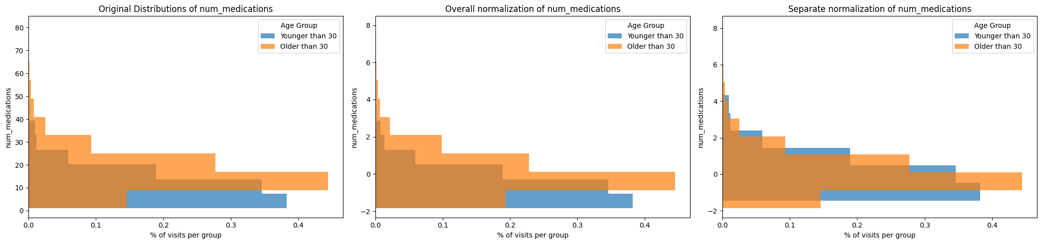
On the left, we can see that the raw distribution of num_medication per stay is different for the age groups: the age group Older than 30 seems to receive generally more medications per stay.
For many downstream tasks, the units need to be normalized; e.g. for a model to consider the number of medications together with blood pressure, and arbitrary choices of units, can lead to vastly different scales of numbers.
Here, we consider scaling the values to zero mean and unit variance. ehrapy supplies options for doing this in two ways:
Jointly normalizing (middle plot) normalizes the values across the entire dataset.
Separately normalizing by group (right plot) normalizes the values within groups.
Which way to choose can depend on the data, the groups and the task at hand. For the number of medications, it is likely we want to normalize across the entire group, maintaining the relationships of high/low number of received medications across the entire dataset.
For values known to show different physiological norms between groups, e.g. blood pressure between groups of gender and groups of age, it can make sense to normalize within groups. This way, within-group outliers are recognizable as such.
Mitigation strategies#
Ask data collectors to adhere to standardized protocols across all sites and providers to ensure consistency in how data is recorded.
Choose robust normalization methods that are suitable for the type of data and the analytical goals. Methods like z-score normalization or min-max scaling can be used to standardize data ranges without distorting relationships in the data.
To discuss the following biases, we will resort to synthetic datasets.
Coding bias#
Coding bias is a special case of information bias that arises when there are discrepancies or inconsistencies in how medical conditions, procedures, and outcomes are coded, often due to variation in the understanding and application of coding systems by different healthcare providers. This can lead to misrepresentation of patient conditions, treatments received, and outcomes. For example, two providers may code the same symptom differently, leading to challenges in accurately aggregating and comparing data across EHR systems.
Scenario: High level vs fine grained ICD codes#
edata = ed.EHRData(
    obs=pd.DataFrame(
        {
            "patient_id": [
                "P1",
                "P2",
                "P3",
                "P4",
                "P5",
                "P6",
                "P7",
                "P8",
                "P9",
                "P10",
                "P1",
                "P2",
                "P3",
                "P4",
                "P5",
                "P6",
                "P7",
                "P8",
                "P9",
                "P10",
            ],
            "provider_id": ["ProvA"] * 10 + ["ProvB"] * 10,
            "condition_coded": ["E11"] * 3 + ["I11"] * 7 + ["E11.9"] * 6 + ["I11.0"] * 4,
        }
    )
)
condition_counts = edata.obs.groupby(["provider_id", "condition_coded"]).size().unstack(fill_value=0)

condition_counts.plot(kind="bar", figsize=(10, 6), alpha=0.75, rot=0)
plt.title("Condition Coding Discrepancies Between Providers Using ICD-10")
plt.ylabel("Count of Conditions")
plt.xlabel("Provider ID")
plt.xticks(range(len(condition_counts.index)), condition_counts.index)
plt.legend(title="ICD-10 Condition Coded", bbox_to_anchor=(1.05, 1), loc="upper left")
plt.tight_layout()
plt.show()
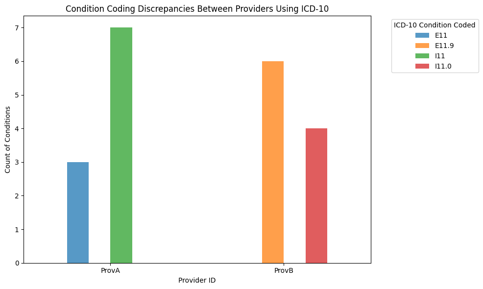
Here, provider A used more general codes (E11 for type 2 diabetes mellitus and I11 for hypertensive heart diseases), whereas provider B used more specific codes (E11.9 for type 2 diabetes mellitus without complications and I11.0 for Hypertensive heart disease with heart failure.)
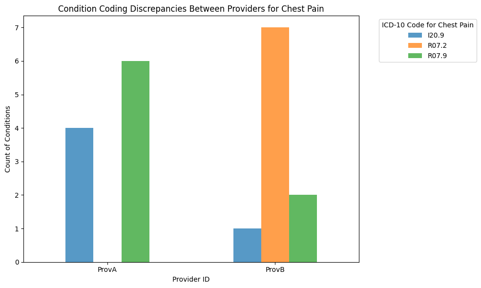
Scenario: Overlapping symptoms#
A more nuanced example of coding bias might involve different providers using entirely different codes for conditions that have overlapping symptoms or can be classified in multiple ways. For instance, some conditions have both acute and chronic forms, and providers might differ in their thresholds for coding one over the other.
Let’s consider chest pain, which can be coded in multiple ways in ICD-10 based on its cause and nature:
R07.9: Chest pain, unspecified
I20.9: Angina pectoris, unspecified
R07.2: Precordial pain
Let’s assume that:
Provider A tends to code most cases as unspecified chest pain (R07.9), but sometimes as angina (I20.9).
Provider B tends to use the more specific precordial pain (R07.2) code frequently, but also uses the unspecified codes.
edata = ed.EHRData(
    obs=pd.DataFrame(
        {
            "patient_id": [
                "P1",
                "P2",
                "P3",
                "P4",
                "P5",
                "P6",
                "P7",
                "P8",
                "P9",
                "P10",
                "P11",
                "P12",
                "P13",
                "P14",
                "P15",
                "P16",
                "P17",
                "P18",
                "P19",
                "P20",
            ],
            "provider_id": ["ProvA"] * 10 + ["ProvB"] * 10,
            # Different coding choices for chest pain by providers
            "condition_coded": ["R07.9"] * 6 + ["I20.9"] * 4 + ["R07.2"] * 7 + ["R07.9"] * 2 + ["I20.9"] * 1,
        }
    )
)

condition_counts = edata.obs.groupby(["provider_id", "condition_coded"]).size().unstack(fill_value=0)

condition_counts.plot(kind="bar", figsize=(10, 6), alpha=0.75, rot=0)
plt.title("Condition Coding Discrepancies Between Providers for Chest Pain")
plt.ylabel("Count of Conditions")
plt.xlabel("Provider ID")
plt.xticks(range(len(condition_counts.index)), condition_counts.index)
plt.legend(title="ICD-10 Code for Chest Pain", bbox_to_anchor=(1.05, 1), loc="upper left")
plt.tight_layout()
plt.show()
Mitigation strategies#
Ask data collection partners to enforce standardized protocols and training for coding practices to ensure consistency across different healthcare providers and settings.
Provide ongoing training and updates for medical coders and healthcare providers about the latest coding standards (e.g., ICD-11, CPT codes) to maintain accuracy and reduce variability.
Implement procedures for cross-checking codes entered into the EHR by different coders or systems, and validate coding accuracy with actual clinical documentation.
Consider using disease ontologies such as Mondo to reduce the variability in how different providers and ontologies code the same condition.
We provide a tutorial on how to map against Disease ontologies here.
Attrition bias#
Attrition bias emerges when there is a systematic difference between participants who continue to be followed up within the healthcare system and those who are lost to follow-up or withdraw from the system. This can lead to skewed outcomes or distorted associations in longitudinal studies, as the data may no longer be representative of the original population. For example, if patients with more severe conditions are more likely to remain engaged in the healthcare system for ongoing treatment, studies may overestimate the prevalence of these conditions and their associated healthcare outcomes.
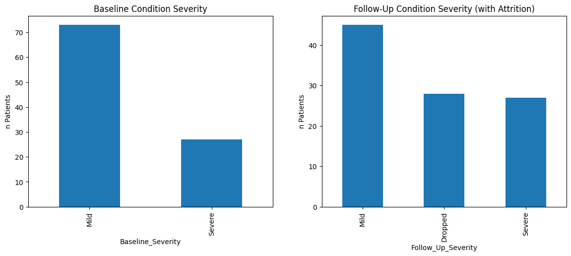
Scenario: Follow up severeity has censored patients#
To illustrate the attrition bias, we consider a hypothetical scenario of 100 patients, of which roughly 70% have a “mild” condition and 30% have a “severe” condition.
We represent what a distribution could look like, if we assume that of the “mild” condition, only ~60% stay within the monitoring system, while all of the “severe” condition stay within the monitoring system due to continued visits to health facilities.
from scipy.stats import chi2_contingency

NUM_PATIENTS = 100
NUM_MILD = 70
NUM_SEVERE = 30

P_MILD_DROPPING = 1 - 0.6

rng = np.random.default_rng(seed=42)
patient_ids = np.arange(NUM_PATIENTS)
condition_severity = rng.choice(
    ["Mild", "Severe"],
    size=NUM_PATIENTS,
    p=[NUM_MILD / NUM_PATIENTS, NUM_SEVERE / NUM_PATIENTS],
)
follow_up_severity = [
    severity if (severity == "Severe" or rng.random() > P_MILD_DROPPING) else "Dropped"
    for severity in condition_severity
]

edata = ed.EHRData(
    X=np.zeros((len(patient_ids), 1)),
    obs=pd.DataFrame(
        {
            "Baseline_Severity": condition_severity,
            "Follow_Up_Severity": follow_up_severity,
        },
        index=patient_ids,
    ),
)

baseline_counts = edata.obs["Baseline_Severity"].value_counts().reindex(["Mild", "Severe", "Dropped"], fill_value=0)
followup_counts = edata.obs["Follow_Up_Severity"].value_counts().reindex(["Mild", "Severe", "Dropped"], fill_value=0)
contingency_table = pd.concat([baseline_counts, followup_counts], axis=1)
chi2, p_val, dof, expected = chi2_contingency(contingency_table)

fig, ax = plt.subplots(1, 2, figsize=(14, 5))
edata.obs["Baseline_Severity"].value_counts().plot(kind="bar", ax=ax[0])
ax[0].set_title("Baseline Condition Severity")
edata.obs["Follow_Up_Severity"].value_counts().plot(kind="bar", ax=ax[1])
ax[1].set_title("Follow-Up Condition Severity (with Attrition)")
ax[0].set_ylabel("n Patients")
ax[1].set_ylabel("n Patients")
plt.show()

print(f"Chi-square p-value: {p_val}")
Chi-square p-value: 3.000103672728807e-08
The attrition bias is evident when the proportion of patients with ‘Severe’ conditions increases from baseline to follow-up, not because the condition of patients worsens over time, but because those with ‘Mild’ conditions are more likely to drop out (‘Dropped’). The chi-square test determined (p value < 0.05) that the distribution of categoricals differs between base line and follow up.
Mitigation strategies#
Encourage data collectors to implement robust follow-up procedures to minimize loss to follow-up. Use multiple contact methods and reminders to keep participants engaged over the study period.
Systematically collect and analyze reasons for dropout to understand if they are related to the study conditions or other factors, which could indicate bias.
Compare baseline characteristics of participants who drop out versus those who remain to identify any significant differences that could influence the findings.
Confounding bias#
Confounding bias arises when an outside variable, not accounted for in the analysis, influences both the exposure of interest and the outcome, leading to a spurious association between them. This can distort the true effect of the exposure on the outcome, either exaggerating or underestimating it. For example, if a study investigating the effect of a medication on disease progression fails to account for the severity of illness at baseline, any observed effect might be due more to the initial health status of the patient than to the medication itself.
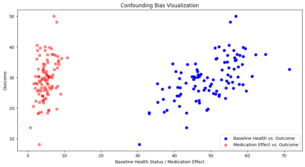
Scenario: Severity if illness as confounder#
We simulates a scenario where patients receive medication that has a positive effect on an outcome. However, the severity of illness at baseline (a confounder) also affects the outcome and is negatively correlated with it. We consider 100 patients, and a baseline health status quantity that follows a normal distribution with mean 50 and standard deviation 10. We model a positive medication effect with a mean of 5, and a standard deviation of 2.
from scipy.stats import pearsonr

rng = np.random.default_rng(42)
NUM_PATIENTS = 100
BASELINE_MEAN = 50
BASELINE_STD = 10
TREATMENT_EFFECT = 5
TREATMENT_EFFECT_STD = 2
baseline_health_status = rng.normal(BASELINE_MEAN, BASELINE_STD, NUM_PATIENTS)
positive_medication_effect = rng.normal(TREATMENT_EFFECT, TREATMENT_EFFECT_STD, NUM_PATIENTS)
negative_confounder_effect = baseline_health_status * -0.5
outcome = (
    baseline_health_status + positive_medication_effect + negative_confounder_effect + rng.normal(0, 5, NUM_PATIENTS)
)

edata = ed.EHRData(
    X=outcome.reshape(-1, 1),
    obs=pd.DataFrame(
        {
            "Baseline Health Status": baseline_health_status,
            "Medication Effect": positive_medication_effect,
            "Outcome": outcome,
        },
        index=pd.Index([f"Patient_{i}" for i in range(NUM_PATIENTS)], name="Patient ID"),
    ),
)

corr_med_effect_outcome, _ = pearsonr(edata.obs["Medication Effect"], edata.obs["Outcome"])
corr_baseline_outcome, _ = pearsonr(edata.obs["Baseline Health Status"], edata.obs["Outcome"])

print(f"Correlation between Medication Effect and Outcome: {corr_med_effect_outcome}")
print(f"Correlation between Baseline Health Status and Outcome: {corr_baseline_outcome}")

plt.figure(figsize=(12, 6))
plt.scatter(
    edata.obs["Baseline Health Status"],
    edata.obs["Outcome"],
    c="blue",
    label="Baseline Health vs. Outcome",
)
plt.scatter(
    edata.obs["Medication Effect"],
    edata.obs["Outcome"],
    c="red",
    alpha=0.5,
    label="Medication Effect vs. Outcome",
)
plt.xlabel("Baseline Health Status / Medication Effect")
plt.ylabel("Outcome")
plt.legend()
plt.title("Confounding Bias Visualization")
plt.show()

# Mitigation strategy: Include baseline health status as a covariate in a regression model

edata = ed.move_to_x(edata, ["Medication Effect", "Baseline Health Status", "Outcome"])
model = ep.tl.ols(edata, formula="Outcome ~ Q('Medication Effect') + Q('Baseline Health Status')")
print(model.fit().summary())
Correlation between Medication Effect and Outcome: 0.3504454247641602
Correlation between Baseline Health Status and Outcome: 0.590971020676291
                            OLS Regression Results
==============================================================================
Dep. Variable:                Outcome   R-squared:                       0.437
Model:                            OLS   Adj. R-squared:                  0.425
Method:                 Least Squares   F-statistic:                     37.62
Date:                Wed, 25 Mar 2026   Prob (F-statistic):           8.06e-13
Time:                        18:44:07   Log-Likelihood:                -304.74
No. Observations:                 100   AIC:                             615.5
Df Residuals:                      97   BIC:                             623.3
Df Model:                           2
Covariance Type:            nonrobust
===============================================================================================
                                  coef    std err          t      P>|t|      [0.025      0.975]
-----------------------------------------------------------------------------------------------
Intercept                      -0.2226      3.504     -0.064      0.949      -7.177       6.732
Q('Medication Effect')          1.0356      0.267      3.884      0.000       0.506       1.565
Q('Baseline Health Status')     0.4946      0.067      7.354      0.000       0.361       0.628
==============================================================================
Omnibus:                        3.227   Durbin-Watson:                   1.893
Prob(Omnibus):                  0.199   Jarque-Bera (JB):                2.568
Skew:                           0.345   Prob(JB):                        0.277
Kurtosis:                       3.374   Cond. No.                         341.
==============================================================================

Notes:
[1] Standard Errors assume that the covariance matrix of the errors is correctly specified.
The stronger correlation of the baseline health status and the outcome compared to the medication and the outcome suggests that the baseline health status is a confounder. It can be observed that patients with different baseline health statuses have different outcomes even before considering the medication effect.
Mitigation strategies#
To mitigate confounding bias, including the baseline health status as a covariate in a regression model allows for the adjustment of the medication effect on the outcome for the variance explained by baseline health status. The ols regression model fits an ordinary least squares regression using the outcome as the dependent variable and both the medication effect and baseline health status as independent variables. The regression has adjusted for the confounding variable (baseline health status), and the medication effect remains significant. Finally, the results provide evidence against the null hypothesis (that the medication has no effect) and affirm that the medication does have a significant effect on the outcome when the baseline health status is taken into account.
More generally, we recommend to:
Plan the study with consideration for potential confounders, ensuring that data on all relevant variables is collected.
Stratify the data during analysis to control for confounding factors, analyzing the effects within each stratum of the confounder.
Employ propensity score matching, stratification, or weighting to balance the distribution of confounding variables between treated and control groups.
Conduct sensitivity analyses to determine how robust the results are to potential confounding.
Consider reducing the feature representation to a smaller set of unrelated components through, for example, PCA.
Fast option to detect biases with ehrapy#
Exploratory analysis remains the most important procedure for spotting and understanding bias in the dataset.
To get an overview of potential biases, ehrapy provides a simple method to determine multiple key statistics involving feature correlations, standardized mean differences, categorical value counts and feature importances for predicting other features.
First, we need to determine the feature types in the dataset:
edata = ed.dt.diabetes_130_fairlearn()
ed.infer_feature_types(edata)
! Feature 'readmit_binary' was detected as categorical features stored numerically. Adjust using `ed.replace_feature_types` if needed.
 Detected feature types for EHRData object with 101766 obs and 24 vars
╠══ 📅 Date features
╠══ 📐 Numerical features
║   ╠══ num_lab_procedures
║   ╠══ num_medications
║   ╠══ num_procedures
║   ╠══ number_diagnoses
║   ╚══ time_in_hospital
╚══ 🗂️ Categorical features
    ╠══ A1Cresult (3 categories)
    ╠══ admission_source_id (3 categories)
    ╠══ age (3 categories)
    ╠══ change (2 categories)
    ╠══ diabetesMed (2 categories)
    ╠══ discharge_disposition_id (2 categories)
    ╠══ gender (3 categories)
    ╠══ had_emergency (2 categories)
    ╠══ had_inpatient_days (2 categories)
    ╠══ had_outpatient_days (2 categories)
    ╠══ insulin (4 categories)
    ╠══ max_glu_serum (3 categories)
    ╠══ medicaid (2 categories)
    ╠══ medical_specialty (6 categories)
    ╠══ medicare (2 categories)
    ╠══ primary_diagnosis (5 categories)
    ╠══ race (6 categories)
    ╠══ readmit_binary (2 categories)
    ╚══ readmitted (3 categories)
edata.var["feature_type"].loc[["time_in_hospital", "number_diagnoses", "num_procedures"]] = "numeric"
ed.feature_type_overview(edata)
 Detected feature types for EHRData object with 101766 obs and 24 vars
╠══ 📅 Date features
╠══ 📐 Numerical features
║   ╠══ num_lab_procedures
║   ╠══ num_medications
║   ╠══ num_procedures
║   ╠══ number_diagnoses
║   ╚══ time_in_hospital
╚══ 🗂️ Categorical features
    ╠══ A1Cresult (3 categories)
    ╠══ admission_source_id (3 categories)
    ╠══ age (3 categories)
    ╠══ change (2 categories)
    ╠══ diabetesMed (2 categories)
    ╠══ discharge_disposition_id (2 categories)
    ╠══ gender (3 categories)
    ╠══ had_emergency (2 categories)
    ╠══ had_inpatient_days (2 categories)
    ╠══ had_outpatient_days (2 categories)
    ╠══ insulin (4 categories)
    ╠══ max_glu_serum (3 categories)
    ╠══ medicaid (2 categories)
    ╠══ medical_specialty (6 categories)
    ╠══ medicare (2 categories)
    ╠══ primary_diagnosis (5 categories)
    ╠══ race (6 categories)
    ╠══ readmit_binary (2 categories)
    ╚══ readmitted (3 categories)
Next, we encode the data and call the detect_bias function to identify potential biases in the dataset. The bias detection can be called for a pre-defined set of sensitive features, as done here, or we can detect biases for all features in the dataset by setting sensitive_features="all".
To speed up notebook execution, we subset to the first 5’000 patients:
edata = ep.pp.encode(edata[:5000].copy(), autodetect=True, encodings="label")
results_dict = ep.pp.detect_bias(edata, sensitive_features=["race", "gender", "age", "medicare", "medicaid"])
! Detected no columns that need to be encoded. Leaving passed EHRData/AnnData object unchanged.
The detect_bias function returns a dictionary of results, including standardized mean differences, feature correlations, feature importances, and categorical value counts for the sensitive features.
We can look at each of these results to identify potential biases in the dataset.
The feature correlations heatmap can help identify relationships between features that may influence each other:
sns.heatmap(edata.varp["feature_correlations"], cmap="coolwarm", vmin=-1, vmax=1)
<Axes: >
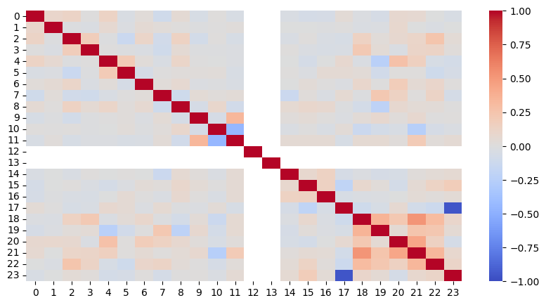
Based on the heatmap, we conclude that we do not have strongly correlating features in the dataset. The variables regarding readmission, stored as readmit_binary and readmitted, unsurprisingly show a strong correlation, however, this is not of interest as none of the sensitive features are involved in this correlation.
Let’s look at the standardized mean differences for the sensitive features, which look at each numerical feature’s mean difference between the sensitive groups:
results_dict["standardized_mean_differences"]
| Sensitive Feature | Sensitive Group | Compared Feature | Standardized Mean Difference | |
|---|---|---|---|---|
| 3 | ehrapycat_age | '30 years or younger' | number_diagnoses | -1.497132 |
| 1 | ehrapycat_age | '30 years or younger' | num_procedures | -0.786052 |
| 2 | ehrapycat_age | '30 years or younger' | num_medications | -0.782121 |
| 0 | ehrapycat_race | Hispanic | number_diagnoses | -0.612002 |
The results above show that the age group “30 years or younger” has meaningfully fewer diagnoses and medications compared to all other age groups. For downstream analyses, this should be taken into consideration, especially when comparing outcomes across different age groups.
Conclusion#
Biases in (EHR) data, as well as models and analyses building on it, can occur in many forms, and sometimes be hard to find. Discussions with experts in the domain where the data was acquired, exploratory data analysis, and reporting of processing steps and are required towards mitigating biases.