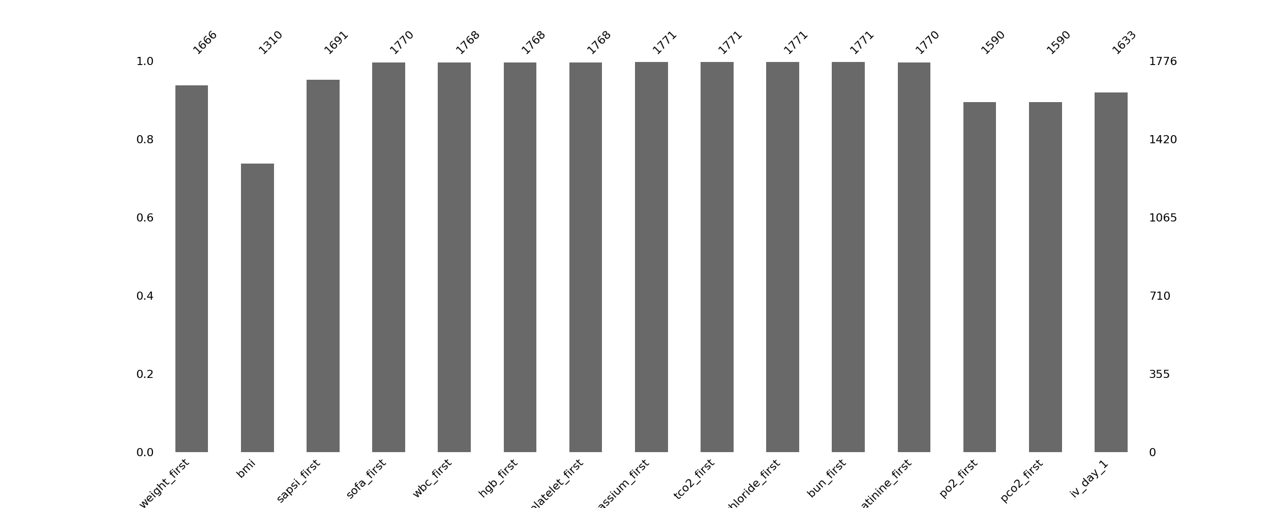
ehrapy.plot.missing_values_barplot#
- ehrapy.plot.missing_values_barplot(edata, *, log=False, filter=None, max_cols=0, max_percentage=0, sort=None, figsize=None, color='dimgray', fontsize=16, labels=None, label_rotation=45, orientation=None, categoricals=False, layer=None)[source]#
A bar chart visualization of the nullity of the given data object.
- Parameters:
edata (
EHRData) – Central data object.log (
bool, default:False) – Whether to display a logarithmic plot.filter (
str|None, default:None) – The filter to apply to the barplot. Should be one of “top”, “bottom”, or None.max_cols (
int, default:0) – The max number of columns from the data object to include.max_percentage (
float, default:0) – The max percentage fill of the columns from the data object.sort (
str|None, default:None) – The row sort order to apply. Can be “ascending”, “descending”, or None.figsize (
tuple|None, default:None) – The size of the figure to display.color (
str, default:'dimgray') – The color of the filled columns.fontsize (
float, default:16) – The figure’s font size.labels (
str|None, default:None) – Whether to display the column names.label_rotation (
float, default:45) – What angle to rotate the text labels to.orientation (
str|None, default:None) – The way the bar plot is oriented.categoricals (
bool, default:False) – Whether to include “ehrapycat” columns to the plot.
- Returns:
The plot axis.
Examples
>>> import ehrdata as ed
>>> import ehrapy as ep
>>> edata = ed.dt.mimic_2()
>>> ep.pl.missing_values_barplot(edata, filter="bottom", max_cols=15, max_percentage=0.999)
- Preview: