
Cohort Tracking#
The use of non-representative samples of a population when doing research on health questions gives raise to serious issues, importantly:
Conclusions drawn on subgroups (by age, gender, race, …) may not generalize to other subgroups
Underrepresented group’s characteristics may be hidden by the overrepresented group’s data
Models, such as clinical algorithms, trained on such samples may pick up, or even further amplify, biases in e.g. clinical decision making
For studies addressing medical questions, it is necessary to define exclusion and inclusion criteria. To detect, track and monitor the effects of such criteria on the composition of the study cohort, Ellen et al. propose a visual aid in the form of a flowchart diagram.
Here, we show how ehrapy can help to track and visualize key demographics of interest during filtering steps.
Environment setup#
import ehrapy as ep
import ehrdata as ed
from tableone import TableOne
Load the data#
We load the Diabetes 130-Hospitals dataset, which comes with a convenience loader in ehrapy.
More information on the dataset can be found here. We use a preprocessed version by fairlearn, from which more information can be found here.
edata = ed.dt.diabetes_130_fairlearn(columns_obs_only=["gender", "race", "time_in_hospital", "medicaid"])
! File ehrapy_data/diabetes_130_fairlearn.csv already exists! Using already downloaded dataset...
Inspecting the dataset with tableone#
TableOne(edata.obs, categorical=["gender", "race", "medicaid"])
| Missing | Overall | ||
|---|---|---|---|
| n | 101766 | ||
| gender, n (%) | Female | 54708 (53.8) | |
| Male | 47055 (46.2) | ||
| Unknown/Invalid | 3 (0.0) | ||
| race, n (%) | AfricanAmerican | 19210 (18.9) | |
| Asian | 641 (0.6) | ||
| Caucasian | 76099 (74.8) | ||
| Hispanic | 2037 (2.0) | ||
| Other | 1506 (1.5) | ||
| Unknown | 2273 (2.2) | ||
| time_in_hospital, mean (SD) | 0 | 4.4 (3.0) | |
| medicaid, n (%) | False | 98234 (96.5) | |
| True | 3532 (3.5) |
In the following, we show how this view can be complemented in ehrapy with a graphical representation
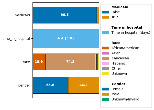
Inspecting the dataset with CohortTracker#
# instantiate the cohort tracker
ct = ep.tl.CohortTracker(edata, categorical=["gender", "race", "medicaid"])

# track the initial state of the dataset
ct(edata, label="Initial cohort")

# plot the change of the cohort
ct.plot_cohort_barplot(
    legend_subtitles_names={
        "medicaid": "Medicaid",
        "time_in_hospital": "Time in hospital",
        "race": "Race",
        "gender": "Gender",
    },
    legend_labels={"time_in_hospital": "Time in hospital (days)"},
)
Tracking the processing and filtering of a dataset with CohortTracker#
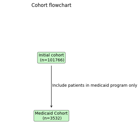
Ellen et al. advocate to integrate a detailed participant flow diagram into the workflow of data reporting to track the changes in sociodemographic and clinical characteristics of each phase of a study.
The CohortTracker allows logging filtering steps with optional comments to recover such a filtering flow.
# instantiate the cohort tracker
ct = ep.tl.CohortTracker(edata, categorical=["gender", "race", "medicaid"])
# track the initial state of the dataset
ct(edata, label="Initial cohort")
# do a filtering step
edata = edata[edata.obs.medicaid]
# track the filtered dataset
ct(
edata,
label="Medicaid Cohort",
operations_done="Include patients in medicaid program only",
)
# plot the change of the cohort
ct.plot_cohort_barplot(
legend_subtitles_names={
"medicaid": "Medicaid",
"time_in_hospital": "Time in hospital",
"race": "Race",
"gender": "Gender",
},
legend_labels={"time_in_hospital": "Time in hospital (days)"},
show=False,
)
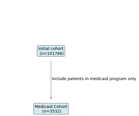
# plot a flowchart
ct.plot_flowchart()
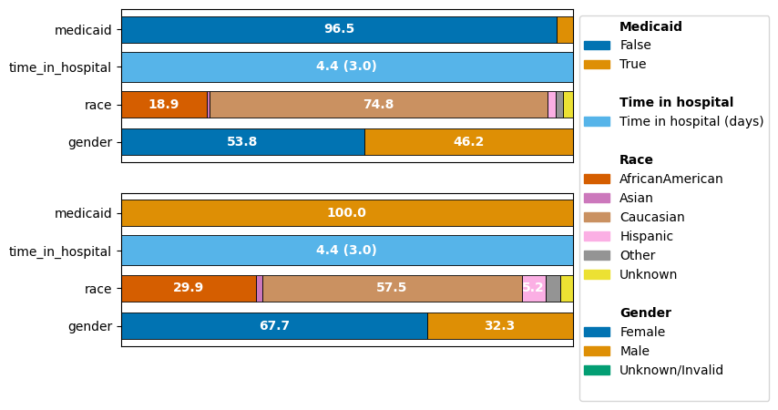
As we can see, focusing on the Medicaid cohort actually drastically shifts other demographics as well: The over-representation of the “Caucasian” population decreased and the imbalance between the representation of the genders is pronounced much more in this cohort.
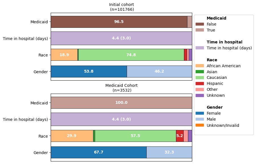
Customizing plots#
fig, ax = ct.plot_cohort_barplot(
    subfigure_title=True,
    yticks_labels={
        "medicaid": "Medicaid",
        "time_in_hospital": "Time in hospital (days)",
        "race": "Race",
        "gender": "Gender",
    },
    color_palette="tab20",
    legend_labels={
        "time_in_hospital": "Time in hospital (days)",
        "AfricanAmerican": "African American",
    },
    legend_subtitles_names={
        "medicaid": "Medicaid",
        "time_in_hospital": "Time in hospital",
        "race": "Race",
        "gender": "Gender",
    },
    show=False,
)
fig.subplots_adjust(top=1.2)

ct.plot_flowchart(
    title="Cohort flowchart",
    node_color="#d9ead3",
    edge_color="black",
)
Branching cohorts (CONSORT-style flowcharts)#
Real studies rarely process one cohort linearly: participants are screened, enrolled, randomized into arms, and followed up. Pass parent= (a step label or 0-based index) to CohortTracker.__call__ to branch off a previously tracked step. The default parent=None still continues from the previous step, so linear pipelines are unchanged.
enrolled = edata[edata.obs.time_in_hospital >= 2]
arm_a = enrolled[enrolled.obs.race == "Caucasian"]
arm_b = enrolled[enrolled.obs.race == "AfricanAmerican"]

ct_branched = ep.tl.CohortTracker(edata, categorical=["gender", "race", "medicaid"])
ct_branched(edata, label="Screened")
ct_branched(enrolled, label="Enrolled", operations_done="time_in_hospital >= 2")
ct_branched(arm_a, label="Caucasian", operations_done="stratify by race", parent="Enrolled")
ct_branched(arm_b, label="AfricanAmerican", operations_done="stratify by race", parent="Enrolled")
ct_branched(arm_a[arm_a.obs.medicaid], label="Caucasian / Medicaid", operations_done="medicaid only", parent="Caucasian")
ct_branched(arm_b[arm_b.obs.medicaid], label="AA / Medicaid", operations_done="medicaid only", parent="AfricanAmerican")

ct_branched.plot_flowchart(title="CONSORT-style flowchart", width=820, height=560)
plot_flowchart returns a HoloViews/Bokeh overlay, so the rendered diagram is interactive (pan, zoom, hover) directly in the notebook. To save it as a standalone HTML report use hv.save(ct_branched.plot_flowchart(), "flowchart.html").