ehrapy.plot.paga
- ehrapy.plot.paga(adata, threshold=None, color=None, layout=None, layout_kwds=mappingproxy({}), init_pos=None, root=0, labels=None, single_component=False, solid_edges='connectivities', dashed_edges=None, transitions=None, fontsize=None, fontweight='bold', fontoutline=None, text_kwds=mappingproxy({}), node_size_scale=1.0, node_size_power=0.5, edge_width_scale=1.0, min_edge_width=None, max_edge_width=None, arrowsize=30, title=None, left_margin=0.01, random_state=0, pos=None, normalize_to_color=False, cmap=None, cax=None, cb_kwds=mappingproxy({}), frameon=None, add_pos=True, export_to_gexf=False, use_raw=True, plot=True, show=None, save=None, ax=None)[source]
Plot the PAGA graph through thresholding low-connectivity edges.
Compute a coarse-grained layout of the data. Reuse this by passing init_pos=’paga’ to
umap()ordraw_graph()and obtain embeddings with more meaningful global topology [Wolf19]. This uses ForceAtlas2 or igraph’s layout algorithms for most layouts [Csardi06].- Parameters:
adata (
AnnData) –AnnDataobject object containing all observations.threshold (
float|None) – Do not draw edges for weights below this threshold. Set to 0 if you want all edges. Discarding low-connectivity edges helps in getting a much clearer picture of the graph.color (
str|Mapping[str|int,Mapping[Any,float]] |None) – Feature name or obs annotation defining the node colors. Also plots the degree of the abstracted graph when passing {‘degree_dashed’, ‘degree_solid’}. Can be also used to visualize pie chart at each node in the following form: {<group name or index>: {<color>: <fraction>, …}, …}. If the fractions do not sum to 1, a new category called ‘rest’ colored grey will be created.layout (
Optional[Literal['fa','fr','rt','rt_circular','drl','eq_tree',Ellipsis]]) – The node labels. If None, this defaults to the group labels stored in the categorical for whichpaga()has been computed.init_pos (
ndarray|None) – Two-column array storing the x and y coordinates for initializing the layout.root (
int|str|Sequence[int] |None) – If choosing a tree layout, this is the index of the root node or a list of root node indices. If this is a non-empty vector then the supplied node IDs are used as the roots of the trees (or a single tree if the graph is connected). If this is None or an empty list, the root vertices are automatically calculated based on topological sorting.labels (
str|Sequence[str] |Mapping[str,str] |None) – The node labels. If None, this defaults to the group labels stored in the categorical for whichpaga()has been computed.single_component (
bool) – Restrict to largest connected component.solid_edges (
str) – Key for .uns[‘paga’] that specifies the matrix that stores the edges to be drawn solid black.dashed_edges (
str|None) – Key for .uns[‘paga’] that specifies the matrix that stores the edges to be drawn dashed grey. If None, no dashed edges are drawn.transitions (
str|None) – Key for .uns[‘paga’] that specifies the matrix that stores the arrows, for instance ‘transitions_confidence’.fontweight (
str) – Weight of the font.fontoutline (
int|None) – Width of the white outline around fonts.node_size_scale (
float) – Increase or decrease the size of the nodes.node_size_power (
float) – The power with which groups sizes influence the radius of the nodes.edge_width_scale (
float) – Edge with scale in units of rcParams[‘lines.linewidth’].max_edge_width (
float|None) – Max width of solid and dashed edges.arrowsize (
int) – For directed graphs, choose the size of the arrow head head’s length and width. See :py:class: matplotlib.patches.FancyArrowPatch for attribute mutation_scale for more info.left_margin (
float) – Margin to the left of the plot.random_state (
int|None) – For layouts with random initialization like ‘fr’, change this to use different intial states for the optimization. If None, the initial state is not reproducible.pos (
ndarray|str|Path|None) – Two-column array-like storing the x and y coordinates for drawing. Otherwise, path to a .gdf file that has been exported from Gephi or a similar graph visualization software.normalize_to_color (
bool) – Whether to normalize categorical plots to color or the underlying grouping.cax (
Axes|None) – A matplotlib axes object for a potential colorbar.cb_kwds (
Mapping[str,Any]) – Keyword arguments forColorbarBase, for instance, ticks.add_pos (
bool) – Add the positions to adata.uns[‘paga’].export_to_gexf (
bool) – Export to gexf format to be read by graph visualization programs such as Gephi.use_raw (
bool) – Whether to use raw attribute of adata. Defaults to True if .raw is present.plot (
bool) – If False, do not create the figure, simply compute the layout.save (
bool|str|None) – Whether or where to save the plot.
- Return type:
- Returns:
A
Axesobject, if ax is None, else None. If return_data, return the timeseries data in addition to an axes.
Examples
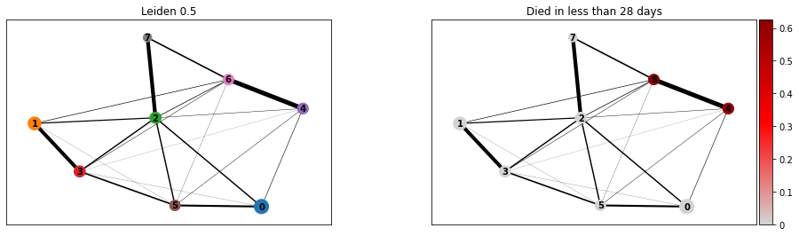
>>> import ehrapy as ep
>>> adata = ep.dt.mimic_2(encoded=True)
>>> ep.pp.knn_impute(adata)
>>> ep.pp.log_norm(adata, offset=1)
>>> ep.pp.neighbors(adata)
>>> ep.tl.leiden(adata, resolution=0.5, key_added="leiden_0_5")
>>> ep.tl.paga(adata, groups="leiden_0_5")
>>> ep.pl.paga(
...     adata,
...     color=["leiden_0_5", "day_28_flg"],
...     cmap=ep.pl.Colormaps.grey_red.value,
...     title=["Leiden 0.5", "Died in less than 28 days"],
... )
- Preview: