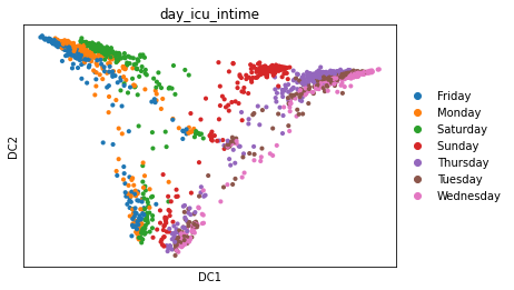
ehrapy.plot.diffmap
- ehrapy.plot.diffmap(adata, **kwargs)[source]
Scatter plot in Diffusion Map basis.
- Parameters:
adata –
AnnDataobject object containing all observations.color – Keys for annotations of observations/patients or features, e.g., ‘ann1’ or [‘ann1’, ‘ann2’].
feature_symbols – Column name in .var DataFrame that stores feature symbols. By default var_names refer to the index column of the .var DataFrame. Setting this option allows alternative names to be used.
use_raw – Use .raw attribute of adata for coloring with feature values. If None, defaults to True if layer isn’t provided and adata.raw is present.
layer – Name of the AnnData object layer that wants to be plotted. By default adata.raw.X is plotted. If use_raw=False is set, then adata.X is plotted. If layer is set to a valid layer name, then the layer is plotted. layer takes precedence over use_raw.
sort_order – For continuous annotations used as color parameter, plot data points with higher values on top of others.
groups – Restrict to a few categories in categorical observation annotation. The default is not to restrict to any groups.
components – For instance, [‘1,2’, ‘2,3’]. To plot all available components use components=’all’.
projection – Projection of plot (default: ‘2d’).
legend_loc – Location of legend, either ‘on data’, ‘right margin’ or a valid keyword for the loc parameter of
Legend.legend_fontsize – Numeric size in pt or string describing the size. See
set_fontsize().legend_fontweight – Legend font weight. A numeric value in range 0-1000 or a string. Defaults to ‘bold’ if legend_loc == ‘on data’, otherwise to ‘normal’. See
set_fontweight().legend_fontoutline – Line width of the legend font outline in pt. Draws a white outline using the path effect
withStroke.size – Point size. If None, is automatically computed as 120000 / n_features. Can be a sequence containing the size for each observation. The order should be the same as in adata.obs.
color_map – Color map to use for continous variables. Can be a name or a
Colormapinstance (e.g. “magma”, “viridis” or mpl.cm.cividis), seeget_cmap(). If None, the value of mpl.rcParams[“image.cmap”] is used. The default color_map can be set usingset_figure_params().palette – Colors to use for plotting categorical annotation groups. The palette can be a valid
ListedColormapname (‘Set2’, ‘tab20’, …), aCyclerobject, a dict mapping categories to colors, or a sequence of colors. Colors must be valid to matplotlib. (seeis_color_like()). If None, mpl.rcParams[“axes.prop_cycle”] is used unless the categorical variable already has colors stored in adata.uns[“{var}_colors”]. If provided, values of adata.uns[“{var}_colors”] will be set.na_color – Color to use for null or masked values. Can be anything matplotlib accepts as a color. Used for all points if color=None.
na_in_legend – If there are missing values, whether they get an entry in the legend. Currently only implemented for categorical legends.
frameon – Draw a frame around the scatter plot. Defaults to value set in
set_figure_params()(default: True).title – Provide title for panels either as string or list of strings, e.g. [‘title1’, ‘title2’, …].
vmin – The value representing the lower limit of the color scale. Values smaller than vmin are plotted with the same color as vmin. vmin can be a number, a string, a function or None. If vmin is a string and has the format pN, this is interpreted as a vmin=percentile(N). For example vmin=’p1.5’ is interpreted as the 1.5 percentile. If vmin is function, then vmin is interpreted as the return value of the function over the list of values to plot. For example to set vmin tp the mean of the values to plot, def my_vmin(values): return np.mean(values) and then set vmin=my_vmin. If vmin is None (default) an automatic minimum value is used as defined by matplotlib scatter function. When making multiple plots, vmin can be a list of values, one for each plot. For example vmin=[0.1, ‘p1’, None, my_vmin]
vmax – The value representing the upper limit of the color scale. The format is the same as for vmin.
vcenter – The value representing the center of the color scale. Useful for diverging colormaps. The format is the same as for vmin. Example: sc.pl.umap(adata, color=’TREM2’, vcenter=’p50’, cmap=’RdBu_r’)
add_outline – If set to True, this will add a thin border around groups of dots. In some situations this can enhance the aesthetics of the resulting image
outline_color – Tuple with two valid color names used to adjust the add_outline. The first color is the border color (default: black), while the second color is a gap color between the border color and the scatter dot (default: white).
outline_width – Tuple with two width numbers used to adjust the outline. The first value is the width of the border color as a fraction of the scatter dot size (default: 0.3). The second value is width of the gap color (default: 0.05).
ncols – Number of panels per row. wspace: Adjust the width of the space between multiple panels. hspace: Adjust the height of the space between multiple panels. return_fig: Return the matplotlib figure.
kwargs – Arguments to pass to
matplotlib.pyplot.scatter(), for instance: the maximum and minimum values (e.g. vmin=-2, vmax=5).show – Whether to display the figure or return axis.
save – If True or a str, save the figure. A string is appended to the default filename. Infer the filetype if ending on {‘.pdf’, ‘.png’, ‘.svg’}.
ax – A matplotlib axes object. Only works if plotting a single component.
- Return type:
- Returns:
If show==False a
Axesor a list of it.
Examples
>>> import ehrapy as ep
>>> adata = ep.dt.mimic_2(encoded=True)
>>> ep.pp.knn_impute(adata)
>>> ep.pp.log_norm(adata, offset=1)
>>> ep.pp.neighbors(adata)
>>> ep.tl.diffmap(adata)
>>> ep.pl.diffmap(adata, color="day_icu_intime")
- Preview: