ehrapy.plot.dotplot
- ehrapy.plot.dotplot(adata, var_names, groupby, use_raw=None, log=False, num_categories=7, feature_cutoff=0.0, mean_only_counts=False, cmap='Reds', dot_max=None, dot_min=None, standard_scale=None, smallest_dot=0.0, title=None, colorbar_title='Mean value in group', size_title='Fraction of cells\\nin group (%)', figsize=None, dendrogram=False, feature_symbols=None, var_group_positions=None, var_group_labels=None, var_group_rotation=None, layer=None, swap_axes=False, dot_color_df=None, show=None, save=None, ax=None, return_fig=False, vmin=None, vmax=None, vcenter=None, norm=None, **kwds)[source]
Makes a dot plot of the count values of var_names.
For each var_name and each groupby category a dot is plotted. Each dot represents two values: mean expression within each category (visualized by color) and fraction of observations expressing the var_name in the category (visualized by the size of the dot). If groupby is not given, the dotplot assumes that all data belongs to a single category.
Note
A count is used if it is above the specified threshold which is zero by default.
- Parameters:
adata (
AnnData) – Annotated data matrix.var_names (
Union[str,Sequence[str],Mapping[str,Union[str,Sequence[str]]]]) – var_names should be a valid subset of adata.var_names. If var_names is a mapping, then the key is used as label to group the values (see var_group_labels). The mapping values should be sequences of valid adata.var_names. In this case either coloring or ‘brackets’ are used for the grouping of var names depending on the plot. When var_names is a mapping, then the var_group_labels and var_group_positions are set.groupby (
str) – The key of the observation grouping to consider.use_raw (
bool|None) – Use raw attribute of adata if present.log (
bool) – Plot on logarithmic axis.num_categories (
int) – Only used if groupby observation is not categorical. This value determines the number of groups into which the groupby observation should be subdivided.categories_order – Order in which to show the categories. Note: add_dendrogram or add_totals can change the categories order.
figsize (
tuple[float,float] |None) – Figure size when multi_panel=True. Otherwise the rcParam[‘figure.figsize] value is used. Format is (width, height)dendrogram (
bool|str) – If True or a valid dendrogram key, a dendrogram based on the hierarchical clustering between the groupby categories is added. The dendrogram information is computed usingscanpy.tl.dendrogram(). If tl.dendrogram has not been called previously the function is called with default parameters.feature_symbols (
str|None) – Column name in .var DataFrame that stores feature symbols. By default var_names refer to the index column of the .var DataFrame. Setting this option allows alternative names to be used.var_group_positions (
Sequence[tuple[int,int]] |None) – Use this parameter to highlight groups of var_names. This will draw a ‘bracket’ or a color block between the given start and end positions. If the parameter var_group_labels is set, the corresponding labels are added on top/left. E.g. var_group_positions=[(4,10)] will add a bracket between the fourth var_name and the tenth var_name. By giving more positions, more brackets/color blocks are drawn.var_group_labels (
Sequence[str] |None) – Labels for each of the var_group_positions that want to be highlighted.var_group_rotation (
float|None) – Label rotation degrees. By default, labels larger than 4 characters are rotated 90 degrees.layer (
str|None) – Name of the AnnData object layer that wants to be plotted. By default adata.raw.X is plotted. If use_raw=False is set, then adata.X is plotted. If layer is set to a valid layer name, then the layer is plotted. layer takes precedence over use_raw.colorbar_title (
str|None) – Title for the color bar. New line character (n) can be used.cmap (
str) – String denoting matplotlib color map.standard_scale (
Optional[Literal['var','group']]) – Whether or not to standardize the given dimension between 0 and 1, meaning for each variable or group, subtract the minimum and divide each by its maximum.swap_axes (
bool|None) – By default, the x axis contains var_names (e.g. genes) and the y axis the groupby categories. By setting swap_axes then x are the groupby categories and y the var_names.return_fig (
bool|None) – ReturnsDotPlotobject. Useful for fine-tuning the plot. Takes precedence over show=False.size_title (
str|None) – Title for the size legend. New line character (n) can be used.feature_cutoff (
float) – Count cutoff that is used for binarizing the counts and determining the fraction of patients having the feature. A feature is only used if its counts are greater than this threshold.mean_only_counts (
bool) – If True, counts are averaged only over the patients having the provided feature.dot_max (
float|None) – If none, the maximum dot size is set to the maximum fraction value found (e.g. 0.6). If given, the value should be a number between 0 and 1. All fractions larger than dot_max are clipped to this value.dot_min (
float|None) – If none, the minimum dot size is set to 0. If given, the value should be a number between 0 and 1. All fractions smaller than dot_min are clipped to this value.smallest_dot (
float|None) – If none, the smallest dot has size 0. All counts with dot_min are plotted with this size.show (
bool|None) – Whether to display the figure or return axis.save (
str|bool|None) – If True or a str, save the figure. A string is appended to the default filename. Infer the filetype if ending on {‘.pdf’, ‘.png’, ‘.svg’}.ax (
_AxesSubplot|None) – A matplotlib axes object. Only works if plotting a single component. vmin: The value representing the lower limit of the color scale. Values smaller than vmin are plotted with the same color as vmin.vmax (
float|None) – The value representing the upper limit of the color scale. Values larger than vmax are plotted with the same color as vmax.vcenter (
float|None) – The value representing the center of the color scale. Useful for diverging colormaps.norm (
Normalize|None) – Custom color normalization object from matplotlib. See https://matplotlib.org/stable/tutorials/colors/colormapnorms.html for details.kwds – Are passed to
matplotlib.pyplot.scatter().
- Return type:
- Returns:
If return_fig is True, returns a
DotPlotobject, else if show is false, return axes dict
Example
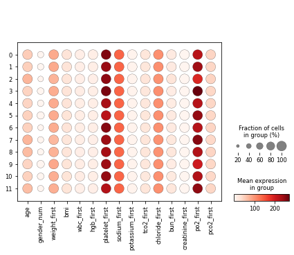
import ehrapy as ep

adata = ep.dt.mimic_2(encoded=True)
ep.pp.knn_impute(adata)
ep.pp.neighbors(adata)
ep.tl.leiden(adata, resolution=0.5, key_added="leiden_0_5")
ep.pl.dotplot(
    adata,
    var_names=[
        "age",
        "gender_num",
        "weight_first",
        "bmi",
        "wbc_first",
        "hgb_first",
        "platelet_first",
        "sodium_first",
        "potassium_first",
        "tco2_first",
        "chloride_first",
        "bun_first",
        "creatinine_first",
        "po2_first",
        "pco2_first",
    ],
    groupby="leiden_0_5",
)
- Preview: