ehrapy.plot.sankey_diagram#
- ehrapy.plot.sankey_diagram(edata, *, columns, node_width=20, node_padding=10, node_color=None, edge_color=None, label_position='right', show_values=True, title=None, width=600, height=400, **kwargs)[source]#
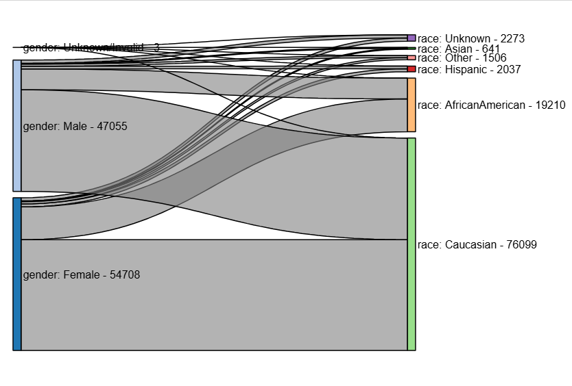
Create a Sankey diagram of relationships across the flat observation table.
- Parameters:
edata (
EHRData) – Central data object.columns (
Sequence[str]) – Column names from edata.obs to visualizenode_width (
int|float, default:20) – Width of the nodes in the Sankey diagram.node_padding (
int|float, default:10) – Padding between nodes in the Sankey diagram.node_color (
str|None, default:None) – Color of the nodes. If None, default coloring is used.edge_color (
str|None, default:None) – Color of the edges. If None, default coloring is used.label_position (
str|None, default:'right') – Position of the labels on the nodes. Options are ‘left’, ‘right’, ‘outer’, or ‘inner’.show_values (
bool, default:True) – Whether to display the values on the edges.title (
str|None, default:None) – Title of the Sankey diagram.width (
int|None, default:600) – Width of the Sankey diagram.height (
int|None, default:400) – Height of the Sankey diagram.**kwargs – Additional styling options passed to
holoviews.element.sankey.Sankey.
- Return type:
Examples
>>> import ehrapy as ep
>>> import ehrdata as ed
>>> edata = ed.dt.diabetes_130_fairlearn(columns_obs_only=["gender", "race"])
>>> ep.pl.sankey_diagram(edata, columns=["gender", "race"])